Art Progress


Life after a jam for a game is weird. Part of me wants to make this game the way I intended with a solid storyline, sweet graphics, music/sound, etc. Another part of me wants to get the simplest working version of this game out. Realistically I'm trying to find a sweet spot that balances both of these ideas. I don't want the game to sit so long that I lose traction and never get a working version done. I also don't want to release something that doesn't make me happy. It's a process, I guess.
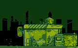
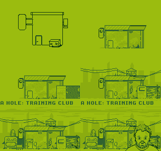
The next build features different locations where you can select of walls with varying holes. I found myself spending a lot of hours just pushing pixels around on these location designs. Following the GameBoy design limitations speeds up my already slow design process. Design decisions with a larger canvas or more than four colors might take a significant amount of time to get right.
This building is supposed to be a Training Gym sort of location, a place to practice sticking your finger in a hole. I like this flat style of isometric pixel art, and it works well with this design. I know I should just be working on getting the core game working correctly; however, working on the art helps clarify other parts of the game.
While it's not the quickest process, switching back from design to code is a rather enjoyable way to proceed. I'm still driving design decisions based on the code and the code decisions based on the design.
It's been helpful for me to step back and write about this game or discuss it with others. As hyper-focused as I can get on building designs, it's crucial to step away for a minute.
I need to remember; this is a game about sticking your finger in a hole. As I proceed, I ask myself a couple of questions....
1. What is the simplest form of this game?
2. What can I do to make this game awesome?
The next steps will be to build out the code for how the location and hole walls menu UI might work.
Drew
Leave a comment
Log in with itch.io to leave a comment.